Monday, March 26, 2018

Survey123

Introduction
The objective of this lab was to create an online survey in ArcGIS online using the Survey123 lesson. The results from the survey could then be brought into the Survey123 Field App and an interactive map was created displaying the results of the survey.

Methods
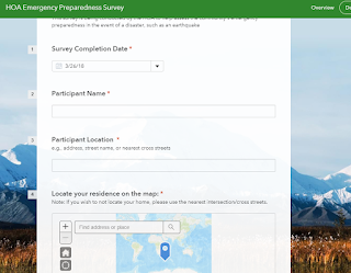
The first step for this lab was to create a survey using the Survey123 website. The survey created was HOA Emergency Preparedness Survey. The survey consisted of 29 questions that were to designed to gauge a community's preparedness for an natural disaster. These questions consisted of questions such as surveyors name, location, housing information, and levels of preparedness (fig. 1). The questions were added using the add function. This function allowed for a variety of different types of questions to be added such as multiple choice, single choice (yes or no), and location maps.
Figure 1. An example of the questions used to complete the survey. 
After the survey was created, the survey was then published to members of my organization (UWEC). Once published, I then filled out the survey by following the provided link: https://survey123.arcgis.com/share/52932b595f0e49a98a5d1b186bff2142. After completing the survey, the Survey123 Field App was downloaded. This app allows for users to be able to download and complete surveys without being directly connected to the internet. Using the app I then completed the survey multiple times using varied answers to my previously completed survey.

After the new survey results were sent from the Survey123 app, the next step of the lab was to analyse the results and create an interactive map displaying the results under the Analyze tab. This tab allows for the results of each individual question (fig. 2) and the location for each of the survey responses (fig. 3).
Figure 2. 
Figure 3.
After analyzing the results, an interactive web map was created that allowed for each of the respondants results to be shown once they were clicked on in the form of a pop-up. The attributes that were shown in the pop-up can also be edited. For example, the surveyor's name and address were omitted from the viewable pop-up. Once the web map was finished, a web-based app created for the survey is accessible to members of the organization.
Figure 4.
Conclusion
The Survery123 allows for surveys to be created and shared with the public. The data can be easily analyzed and the locations of the respondent can be used to analyze spatial spatial patterns survey. This information can then be brought into an app where members of the same organization can have easy access to the survey information.

Sources
Learn ArcGIS: Lessons: Get Started with Survey123 ArcGIS
https://learn.arcgis.com/en/projects/get-started-with-survey123/lessons/create-a-survey.htm

Tuesday, March 13, 2018

BadElf GPS

Introduction
The goal of this lab was to get introducted to the BadElf GPS Pro tracking unit to track a route taken by a group of class around the university campus. The BadElf GPS technogoly directly linked to students iPhones and produced both KML and GPX files. Both of these files can be uploaded into mapping software such as ArcMap and ArcGIS Earth. The BadElf software directly connects to the user's iPhone via Bluetooth. This allows for the user to have access to a device with strong computing power without having to develope or bring another device into the field. Smartphones are also a very strong platform from which different apps can be run off of, allowing for more felxibilyu on the user end. Having the in-field computer being taken care of by the cell phone companies, it allows for GPS manufactures to focus more strongly on the developement of GPS software.

BadElf Compatible Apps
There are many different apps that are compatible with BadElf. These apps span a wide variety of categories such agriculture, aviation, fitness/health, GIS, recreation, travel, and UAS. Below are a few of the apps that I found to be interesting and how the apps are related to my interested.

Fog of World: This app provides a "fog" that covers the world that gets lifted once the user physically enters an area. By doing this, it shows areas in which the user has been. This is an app that would be fun for to use when exploring different cities this summer in Europe as it will show where I have already been and will show me areas in which I still "need" to explore.

Fulcrum: The Fulcrum app allows for users to capture a wide variety of in-field information such as GPS location, text, photos, video, and audio for specific projects. This is an app that I may find to be helpful when conducting GPR research over summer as I could link important on-site information such as GPS location, photos and field notes, to the GPR grids directly.

Mapster: This app allows for very detailed maps to be downloaded to the users cell phone and can be opened without internet connection. This could be a very helpful app for backpacking purposes.  There have been many times that I have been backpacking in areas in which I did not have a physical map or interconnection and having the ability to have an interactive map that doesn't require internet service would be very valuable.

CamerAlert: The CamerAlert app displays the location of red light camera and gives the users average speed when the user's car in within the range of a camera. The app also gives the user alerts whenever he/she is approaching a speed camera.

Cyclemeter Cycling Running GPS: The Cyclemeter Cycling Running app gives the user many different options to improve their fitness. The app can record personal statistics such as heart rate, steps taken, tracking of route, record and provide updates to the user's benchmarks. Being a person who does a lot of biking, especially in the summer months, I think that this could be a very useful app in recording my progress as the summer progresses.

Methods
To begin the lab, the class was divided into groups between and 3 and 4 people. Each group had had an iPhone and downloaded to the phones and once the app was downloaded, the BadElf unit was connected to the phone via bluetooth. Once this was done, different groups were assigned transmitters and the others were given revivever. We were then asked to find the other groups.


Figure 1. BadElf App connected to the iPhone displaying the GPS location 
Once the app was connected to the user's iPhone the app tracked the groups movements. We asked to find the other groups as part of a game of "hide-and-seek". Two groups were given the tracker and the transmitter (fig. 2). 
Figure 2. GPS transmitter for the BadElf reciever 
The tracker (fig 3.) would pick up the signal transmitted by the transmitter and give the direction to which the receiver which would display the direction of the transmitter. Each team alternated between roles of hiding the transmitter and locating it through the use of the receiver. Once the lab was completed the data was brought into ArcMap using the feature from KML tool in ArcMap where it was displayed in the form of a map (fig 4.) tracing our groups route throughout the lab. 
Figure 3. The reciver used to locate the transmiter hide by the other groups.
Figure 4. Map displaying the route our group took throughout the lab.
Conclusion
The BadElf app is a very versatile app that allows for users in the field to connect GPS technology to their their smartphone. This simplifies the amount of equipment required by the end user as the user only needs his/her phone to use the app. The data collected from this app allow for the data to transferred to other mapping software such as ArcMap and ArcGIS Earth in the form of both KML and GPX files.

Monday, March 5, 2018

Processing UAS Data

Introduction
This lab is an extension of our previous lab introduction to Pix4D, however in this lab we asked to process a set a unmaned aerial systems (UAS data. This data included ground control points (GCPs). GCPs improve the spatial accuracy of data by providing reference points for the data to be referenced to.

Methods
To begin the lab we were given a set of UAS data collected by Dr. Hupy (fig. 1). This data consisted of 69 separate UAS images. Before we began processing the data, we had to verify that the data was correct. Pix4D has integrated setting and perameters for different sensors and cameras. The software also reads the images metadata and then assigns the image a set of parameters. To begin we had to verify that the initial parameters were correct. We verified that the correct coordinate system was assigned to the data set. The data was given the WGS UTM Zone 15N coordinate system, which was correct. We also has had to change the camera type to a rolling shutter. We also set initial parameters for our data processing which involved only running the initial processing processing function. This was done to improve processing speed as we still had to make corrections to the GCPs. We also checked the google maps and kml boxes for the final product. This function allows for the data to be shared to a broader audience who may not have access to Pix4D pr ArcMap software. We also created shapefile for the data that consisted of contour lines which when brought into ArcMap would aid in mapping.
Figure 1. The image above displays the study area. The blue crosses seen within the image are the ground control points
Once the previous steps were completed, we were then asked to bring in GCPs. To do this we imported the CGPs using the Y,X,Z format. Once this was done we began the final processing of the data. Once the final processing was completed, we were given a quality report displaying the accuracy of the data (fig. 2). There was an error reported but this corrected later in lab when the GCP location was corrected (fig. 3).
Figure 2. First quality report generated after processing the data

Figure 3. GCP accuracy assessment 
The next step of lab was to correct the location of GCPs.  This was done manually insure that the GCPs were in an accurate location (fig. 4). 
Figure 4. Corrected GCP
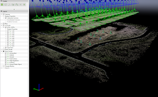
Once the GCPs were calibrated (fig. 5), the data was then reoptimized. The Point Cloud and Mesh and DSM, Orthomosiac and Index were then checked on to finish the final processing. Once this was completed an orthomosiac and digital surface model (DSM) were created were they could later be brought into ArcMap. 
Figure 5. Data set in Ray Cloud once the GCP location was corrected
Results
After the data finished processing, it was brought into ArcMap to create a maps of the study area (fig. 6). The DSM and Orthomosiac images were displayed with hillshade, giving the images a 3D effect. The data did not show any errors in terms of the accuracy between the mosiaced image as there no distortions or gaps in the images. The DSM is pretty simple as the study area did not have a lot of variability in elevation. 
Figure 6. The maps above display the Orthomosiaced and DSM images processed in Pix4D and displayed in ArcMap/
Conclusion
This lab showed that Pix4D is a useful software program for processing UAS data and converting the data into formats that are useful in other mapping softwares such as ArcMap and Google Earth. For the case of this lab, the UAS data set was quite small, but it provide valuable expiernce in processing UAS data as this a growing field within the geospatial community.