Monday, April 30, 2018

Distance Azimuth


Introduction 
The concept of distance and azimuth survey technique is a simple but very effective tool for geographers even with today's technology. This is because GPS can be prone to failure due to interference from large buildings and/or tree canopy over. Also there could be issues with the device itself or may have forgotten it before entering the field. Nevertheless, the distance and azimuth method is a very useful and foundational method in field work.

Methods 
To begin this lab the class was divided into groups of 3 and 4 people. Each group was then to complete a survey of a set of trees on the campuses southern end, on Putnam drive. The survey would consist of gathering data on each tree such tree circumference, tree type, azimuth and distance from the origin of the survey.
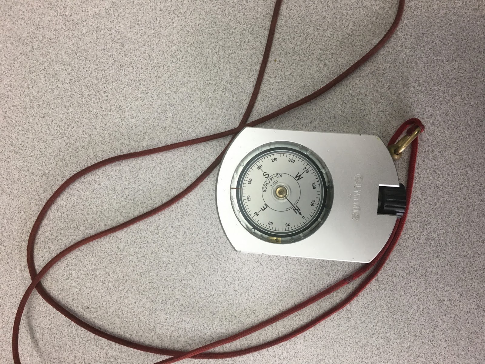
The Each member of the team was given a different tool to complete the survey. The tools used were two tape measures, a range finder, survey compass, GPS receiver, and field notebook. All the measurements and other data was recorded into the field notebook so that the data could be entered into an excel file to be brought into ArcMap (fig. 3).
Figure 1. GPS unit used to record the origin of the survey
Figure 2. Survey compass used collect the azimuth for each the trees in the survey
Figure 3. Excel spreadsheet that has all the data collected during the survey.

The data from the field notebook was transfered into excel. The excel spreadsheet was transfered into a newly created file geodatabase. Using the Bearing Distance to Line tool was used to give the data its azimuth and the Feature Vertixes to Points tool was used to create the individual points for each of the trees.

Results
The first step in evaluating the accuracy of the survey was to visually inspect the accuracy of the GPS location. Qualitatively the accuracy of the GPS appears to be accurate (fig. 1). The survey taken on to the west may be slightly off to the north. This was likely caused by poor GPS signals from tree cover and the adjacent hill located to the south. The map created below (fig. 1) shows the tree type for each of the trees collected within the surveys. When comparing the results of the surveys there is more homogeneity between the tree species in the western survey compared to the survey taken to the east.
Figure 4. Map created in ArcMap that displays the location and tree type for each of the trees within the survey. The locations of the trees was determined by taking the azimuth each of the trees and measuring the distance from the origin. 
Conclusion/discussion
The distance and azimuth survey method is a very effective method for data collection in the field. By taking the distance and azimuth of objects from a single point of origin, accurate spatial data can be taken in the field even without the aid of more sophisticated technology such as GPS.

Friday, April 6, 2018

Arc Collector

Introduction
The purpose of this lab is to use smart phones to collect geospatial data and create climate maps with the newly collected data. Smart phones have far more computing power than most GPS units and therefore it is much for convenient and cost effective to use a smart phone in the field. This lab also introduced domains and their importance for data collection.

Methods
To begin the lab the class was divided into groups and two and asked to collect weather data for the various sections on campus (fig. 1). Each was given a kestrel 3000 to record atmospheric conditions and a compass to record wind direction. The readings were imputed into the Arc Collector where the locations of each of the recordings geolocated using the smart phone's GPS. Domains were created for the different fields to insure that the data was properly imputed into the data set and to minimize normalization issues in the future.
Figure 1. Displays the different sections of campus the various groups were assigned to.
Figure 2. Kestrel 3000 used to collect surface temperature (Fahrenheit), dew point and wind speed 
Each of the groups collected between 20-30 data points in their respective zones giving the data set 154 climatic readings across the campus. Once all the readings were collected they were placed into an ArcGIS Online file (fig. 3). A new personalized map was created using this data so that it could be brought into a geodatabase so that the layers could be brought into ArcMap to create microclimate maps for the campus.
Figure 3. Displays each of groups data points collected in each of their respective zones. 
Results
Below are the four maps created from the data collected using Arc Collector. Looking at the wind speed and wind direction map below a couple patterns are evident. First, the main direction for the wind that day was from the southwest. Areas closure to the river and especially over the walking bridge had the highest wind speeds. Areas in the main campus had lower winds than surrounding areas that had more exposure to the wind. 
Figure 4. Map displaying both the wind direction as well as the wind speed for the campus
Looking at temperature maps below, areas along the river had the lowest surface temperatures and temperature taken at 2 meters. The lower surface temperature along the river is likely a result of the temperature being taken on grass. Areas of blacktop and concrete also had higher surface temperatures. The dew point map (fig. 7) followed trends that would be expected looking at the temperature at 2 meters maps (fig. 6) with areas that had high temperatures also having relatively high dew points and vice versa. 
Figure 5.  Map displaying surface temperature for the campus using graduated symbols.
Figure 6. Map displaying temperature at 2 meters for the campus using graduated symbols.
Figure 7. Map displaying surface dew point for the campus using graduated symbols.
Conclusions
Arc Collector is a very user friendly app that is extremely useful for geospatial analysists. It allows for the user to his/her smart phone to collect data in the field and develop web based applications for that data. Having the ability to have pre-created datasets with domains prior to going into field allows for the user to avoid input errors that may lead to normalization errors when processing the data. 

Monday, March 26, 2018

Survey123

Introduction
The objective of this lab was to create an online survey in ArcGIS online using the Survey123 lesson. The results from the survey could then be brought into the Survey123 Field App and an interactive map was created displaying the results of the survey.

Methods
The first step for this lab was to create a survey using the Survey123 website. The survey created was HOA Emergency Preparedness Survey. The survey consisted of 29 questions that were to designed to gauge a community's preparedness for an natural disaster. These questions consisted of questions such as surveyors name, location, housing information, and levels of preparedness (fig. 1). The questions were added using the add function. This function allowed for a variety of different types of questions to be added such as multiple choice, single choice (yes or no), and location maps.
Figure 1. An example of the questions used to complete the survey. 
After the survey was created, the survey was then published to members of my organization (UWEC). Once published, I then filled out the survey by following the provided link: https://survey123.arcgis.com/share/52932b595f0e49a98a5d1b186bff2142. After completing the survey, the Survey123 Field App was downloaded. This app allows for users to be able to download and complete surveys without being directly connected to the internet. Using the app I then completed the survey multiple times using varied answers to my previously completed survey.

After the new survey results were sent from the Survey123 app, the next step of the lab was to analyse the results and create an interactive map displaying the results under the Analyze tab. This tab allows for the results of each individual question (fig. 2) and the location for each of the survey responses (fig. 3).
Figure 2. 
Figure 3.
After analyzing the results, an interactive web map was created that allowed for each of the respondants results to be shown once they were clicked on in the form of a pop-up. The attributes that were shown in the pop-up can also be edited. For example, the surveyor's name and address were omitted from the viewable pop-up. Once the web map was finished, a web-based app created for the survey is accessible to members of the organization.
Figure 4.
Conclusion
The Survery123 allows for surveys to be created and shared with the public. The data can be easily analyzed and the locations of the respondent can be used to analyze spatial spatial patterns survey. This information can then be brought into an app where members of the same organization can have easy access to the survey information.

Sources
Learn ArcGIS: Lessons: Get Started with Survey123 ArcGIS
https://learn.arcgis.com/en/projects/get-started-with-survey123/lessons/create-a-survey.htm

Tuesday, March 13, 2018

BadElf GPS

Introduction
The goal of this lab was to get introducted to the BadElf GPS Pro tracking unit to track a route taken by a group of class around the university campus. The BadElf GPS technogoly directly linked to students iPhones and produced both KML and GPX files. Both of these files can be uploaded into mapping software such as ArcMap and ArcGIS Earth. The BadElf software directly connects to the user's iPhone via Bluetooth. This allows for the user to have access to a device with strong computing power without having to develope or bring another device into the field. Smartphones are also a very strong platform from which different apps can be run off of, allowing for more felxibilyu on the user end. Having the in-field computer being taken care of by the cell phone companies, it allows for GPS manufactures to focus more strongly on the developement of GPS software.

BadElf Compatible Apps
There are many different apps that are compatible with BadElf. These apps span a wide variety of categories such agriculture, aviation, fitness/health, GIS, recreation, travel, and UAS. Below are a few of the apps that I found to be interesting and how the apps are related to my interested.

Fog of World: This app provides a "fog" that covers the world that gets lifted once the user physically enters an area. By doing this, it shows areas in which the user has been. This is an app that would be fun for to use when exploring different cities this summer in Europe as it will show where I have already been and will show me areas in which I still "need" to explore.

Fulcrum: The Fulcrum app allows for users to capture a wide variety of in-field information such as GPS location, text, photos, video, and audio for specific projects. This is an app that I may find to be helpful when conducting GPR research over summer as I could link important on-site information such as GPS location, photos and field notes, to the GPR grids directly.

Mapster: This app allows for very detailed maps to be downloaded to the users cell phone and can be opened without internet connection. This could be a very helpful app for backpacking purposes.  There have been many times that I have been backpacking in areas in which I did not have a physical map or interconnection and having the ability to have an interactive map that doesn't require internet service would be very valuable.

CamerAlert: The CamerAlert app displays the location of red light camera and gives the users average speed when the user's car in within the range of a camera. The app also gives the user alerts whenever he/she is approaching a speed camera.

Cyclemeter Cycling Running GPS: The Cyclemeter Cycling Running app gives the user many different options to improve their fitness. The app can record personal statistics such as heart rate, steps taken, tracking of route, record and provide updates to the user's benchmarks. Being a person who does a lot of biking, especially in the summer months, I think that this could be a very useful app in recording my progress as the summer progresses.

Methods
To begin the lab, the class was divided into groups between and 3 and 4 people. Each group had had an iPhone and downloaded to the phones and once the app was downloaded, the BadElf unit was connected to the phone via bluetooth. Once this was done, different groups were assigned transmitters and the others were given revivever. We were then asked to find the other groups.


Figure 1. BadElf App connected to the iPhone displaying the GPS location 
Once the app was connected to the user's iPhone the app tracked the groups movements. We asked to find the other groups as part of a game of "hide-and-seek". Two groups were given the tracker and the transmitter (fig. 2). 
Figure 2. GPS transmitter for the BadElf reciever 
The tracker (fig 3.) would pick up the signal transmitted by the transmitter and give the direction to which the receiver which would display the direction of the transmitter. Each team alternated between roles of hiding the transmitter and locating it through the use of the receiver. Once the lab was completed the data was brought into ArcMap using the feature from KML tool in ArcMap where it was displayed in the form of a map (fig 4.) tracing our groups route throughout the lab. 
Figure 3. The reciver used to locate the transmiter hide by the other groups.
Figure 4. Map displaying the route our group took throughout the lab.
Conclusion
The BadElf app is a very versatile app that allows for users in the field to connect GPS technology to their their smartphone. This simplifies the amount of equipment required by the end user as the user only needs his/her phone to use the app. The data collected from this app allow for the data to transferred to other mapping software such as ArcMap and ArcGIS Earth in the form of both KML and GPX files.

Monday, March 5, 2018

Processing UAS Data

Introduction
This lab is an extension of our previous lab introduction to Pix4D, however in this lab we asked to process a set a unmaned aerial systems (UAS data. This data included ground control points (GCPs). GCPs improve the spatial accuracy of data by providing reference points for the data to be referenced to.

Methods
To begin the lab we were given a set of UAS data collected by Dr. Hupy (fig. 1). This data consisted of 69 separate UAS images. Before we began processing the data, we had to verify that the data was correct. Pix4D has integrated setting and perameters for different sensors and cameras. The software also reads the images metadata and then assigns the image a set of parameters. To begin we had to verify that the initial parameters were correct. We verified that the correct coordinate system was assigned to the data set. The data was given the WGS UTM Zone 15N coordinate system, which was correct. We also has had to change the camera type to a rolling shutter. We also set initial parameters for our data processing which involved only running the initial processing processing function. This was done to improve processing speed as we still had to make corrections to the GCPs. We also checked the google maps and kml boxes for the final product. This function allows for the data to be shared to a broader audience who may not have access to Pix4D pr ArcMap software. We also created shapefile for the data that consisted of contour lines which when brought into ArcMap would aid in mapping.
Figure 1. The image above displays the study area. The blue crosses seen within the image are the ground control points
Once the previous steps were completed, we were then asked to bring in GCPs. To do this we imported the CGPs using the Y,X,Z format. Once this was done we began the final processing of the data. Once the final processing was completed, we were given a quality report displaying the accuracy of the data (fig. 2). There was an error reported but this corrected later in lab when the GCP location was corrected (fig. 3).
Figure 2. First quality report generated after processing the data

Figure 3. GCP accuracy assessment 
The next step of lab was to correct the location of GCPs.  This was done manually insure that the GCPs were in an accurate location (fig. 4). 
Figure 4. Corrected GCP
Once the GCPs were calibrated (fig. 5), the data was then reoptimized. The Point Cloud and Mesh and DSM, Orthomosiac and Index were then checked on to finish the final processing. Once this was completed an orthomosiac and digital surface model (DSM) were created were they could later be brought into ArcMap. 
Figure 5. Data set in Ray Cloud once the GCP location was corrected
Results
After the data finished processing, it was brought into ArcMap to create a maps of the study area (fig. 6). The DSM and Orthomosiac images were displayed with hillshade, giving the images a 3D effect. The data did not show any errors in terms of the accuracy between the mosiaced image as there no distortions or gaps in the images. The DSM is pretty simple as the study area did not have a lot of variability in elevation. 
Figure 6. The maps above display the Orthomosiaced and DSM images processed in Pix4D and displayed in ArcMap/
Conclusion
This lab showed that Pix4D is a useful software program for processing UAS data and converting the data into formats that are useful in other mapping softwares such as ArcMap and Google Earth. For the case of this lab, the UAS data set was quite small, but it provide valuable expiernce in processing UAS data as this a growing field within the geospatial community.

Monday, February 26, 2018

Assignment 4: Introduction to Pix4D


Introduction
     The purpose of this assignment is introduce the Pix4D software. This software is used to process unmaned aerial systems data (UAS). This software allows for the processing of point clouds and allows for 3D volume analysis. In order to use  Pix4D, it is very important that the user has high quality data sets. This can incude the use of ground control points (GCPs), geolocation and quality imagery.
     When using using Pix4D it is very important that the UAS data has overlap. It is recommended that a there is a minimum of 75% percent of frontal and 65% of lateral overlap for most situations. If the UAS is flying over over surfaces such as snow and or sand, there needs to be increased overlap for the images. In these cases, it is recommended that the overlap should be increased to 85% frontal and 70% lateral. Pix4D is also capable of producing oblique images, if there is sufficient overlap between the images. Images that were taken over the course of multiple flights can also be processed. This is as long as the total images is below 2000 images. If using images taken from multiple flights, similar flight conditions are desired and overlap between images is very important.
     Rapid Check is also a very important function in Pix4D. This function is used to determine if there is sufficient coverage for the images in the data set. It performs this function quickly by reducing the size of the pixels in the images so that processing speed can increased.
     As mentioned above, Pix4D can use GCPs. While this is not required, it is recommended. Having accurate GCPs aids the quality and accuracy of the overlap between images. GCPs also helpful for other tasks such as processing images without geolocation as well as georeferencing.
     Once an image has been processed the software produces a quality report that contains information on the accuracy of the data collection.

Demostration 
Volume Calculations 
    Pix4D has the ability to calculate volumes of 3D surfaces. This can be done by using the volume tool found in the menu. Once the tool is selected, control points can be placed on the processed image. Once the desired control points have been placed on the image, by simply right-clicking the mouse, the volume can be calculated. This can be seen below, where the volume for 3 gravel pits were calculated using this tool (fig. 1).
    
Figure 1. Three volumes collected using the volume tool
Flyover
     Pix4D can also create animations for data sets. For this example a video was created that "flew" above the processed image. This was done by using the video tool where way points can be placed around the image. This effectively creates a flight path for the animation. Once the video's way-points are collected, the video can be rendered into video formats such mp4 for exportation.

ArcMap
    Data processed in Pix4D can also be brought into ArcMap. For this lab, two maps were created, a digital surface model (DSM) (fig.2 )and orthomosic image (fig, 3). The images for this lab were preprocessed by Dr. Hupy. The DSM and orthomosic images were brought into ArcMap as raster features. For the DSM, a hillshade was created to create better depth in the image using the hillshade tool. Once the hillshade layer was created the DSM was placed over the hillshade and was made 30% percent transparent. The DSM was also imported in ArcScene to create a 3D model. These can be seen in the upper right of two maps.

Figure 2. Displays the DSM brought into ArcMap

Figure 3. Displays the orthomosiac image
Conclusion
      Pix4D is a very effective software for processing UAS images and data sets. When processing UAS data it is important to follow the recommended overlap percentages so that the data can be processed accurately. The software provides many useful tools for calculating volumes, displaying animations, and creation of data that be used in mapping software such as ArcMap.


Monday, February 19, 2018

Navigation Maps

Introduction
     For this lab we were asked to create two naviagtion maps for a future lab using different coordinate systems and map projections. The coordinate systems used were the WGS_1984_UTM_Zone_15N and NAD_1983_HARN_WISCRS_EauClaire_County_Feet were used for the two maps. This lab was done to show how different coordinate systems and projections can be used to make navigation maps. Proper coordinate system and map projection choice is important for creating navigation maps, because if an improper would create a distorted map and therefore hard to navigate. Geographic coordinate systems create a three-dimensional model and map projections create a two-dimensional model to portray the Earth's Surface.

Methods
     We were given a mosaiced raster image that displayed the study area. Before the images could be brought into ArcMap, the map documents were projected into the Mercator projection. The images were then reprojected into their different coordinate systems,  UTM (fig. 1) and HARN. To create elevation contour lines for the two images, the Contour Tool was then used to create a contour intervals for the different maps, 10 feet and 3 meters respectively.
Figure 1. UTM Zones for the United States
     Once the contour lines were created for each of the images, grid systems were then created for each of the two maps. For the UTM map a measured grid was created. This was done under the Layer Data Frame Property Tab. The interval spacing was set at 100 meters. The HARN map used a grapicule grid as it was in decimal degrees, with spacing every 5 degrees.


Results
     The two maps below show the study area contained within the red-outlined box. The contours (maroon) allow for viariabilities in the elevation within the priory to be examined. The different grid systems allow for the locations of places within the priory to be accurately plotted. When looking at the maps, areas in the southwest corner are at a higher elevation than areas in the northeast. Also areas in the western and southeastern corners are at a lower elevation than areas in the southwest.
Figure 2.  The map created in the UTM coordinate system using a measured grid.

Figure 3. Map created using the HARN coordinate system in decimal degrees

Conclusion

     The maps above are displaying the same area but they are doing so in two different ways. Each way provides method for navigating the study area. When creating navigation maps it is important to consider the effects that using different projected and geographic coordinate systems can have on the map as it will effect the ability to navigation accurately.

Sources
http://www.xmswiki.com/wiki/File:Usutm.png

Sandbox Survey

Introduction
     In the previous lab, we collect elevation points for a 114x114 cm sandbox. The data points were collected using a systematic sampling method collecting sample points every 6 cm within the grid. Once the elevation data was recorded it was then transfered into an excel spreadsheet. The data then needed to be normalized to decreased error and ease processing. Normalization refers to cleaning up data so that it uniform and easy to work with. Because a systematic sampling method was chosen for the initial survey, the data was already organized in evenly spaced increments. This allowed for the normalization to be very easily (figure 1).
     The objective for this lab was to take the topology data collected in the previous lab and create 3D topographic profiles in ArcMap and ArcScene. This was done using five interpolation methods 1) spline, 2) IDW, 3) natural neighbor, 4) kriging, and 5) Tin. Each of the methods produce different results when given the same data, because of this each of the interpolation methods will be explained in further detail below.
Figure. 1 Excel sheet displaying the normalized data collected in the previous lab


Methods
     Before the data could be interpolated into 3D topographic profiles, the data needed to be imported into ArcMap. To do this the add X,Y data tool was used create a new shapefile within a newly created feature class in a new geodatabase. The data for this project was left unprojected because the data was not collected using a geographic coordinate system, rather our own coordinate system (see lab 1 for details). Once this was completed the data could then be interpolated. After being interpolated, the models were brought into ArcScene where they were turned into 3D models.
  • Spline: The first interpolation method was spline. Spline uses mathematical estimate values that reduce the curvature of a surface, passing through the center of the data points. This results a profile with a smooth surface. Spline is an effective method when there are a lot of data points but is not optimal if there are few data points as the model tends to over-correct, resulting in a overly simplified profile built upon generalizations. If there are large discrepancies in the elevation of data points that are close together, the model struggles to create realistic profiles. 
  • (Inverse Distance Weighted (IDW): The IDW method estimates cell values by averaging the values of the collected data points using a weighted scale based upon relative distance to the sample point. For example, if a cell is closer to the sample point, it will have a higher weight assigned to that cell in comparison to a cell further away.
  • Natural Neighbor: This method places a strong importance on the sample points themselves and creates regions surronding each point. 
  • Kriging: This method is more complex than the previous methods as it uses formulas to create an estimated surface based upon sample point values. This model takes into consideration the correlations between direction and distance to predict a surface.  
  • Triangulated Irregular Network (TIN): Tin models are created using set of vertices (sample points) to create a triangulated network using Delaunay triangulation. TIN models create high resolution areas where there is high amounts of variability between points and lower resolution models where data points have low variability. 
     Once the models were run, 2D topographic profiles were created, where they were later imported into ArcScene to create 3D topographic profiles.

Results
Spline: The first interpolation method was spline (figure 2). This created a smooth surface that accurately portrayed the surface of the sandbox. Areas in the southwest corner were over generalized as they were more flat in sandbox than the model portrayed. Of the five interpolation methods, this produced the most aesthetically pleasing model.
Figure 2. Spline 3D interpolation model

IDW: The second model used was the IDW interpolation method (figure 3). This model does portray the elevation changes in the sand box quite well, however the model fails to smooth the surface. This produces a model that has unusual looking bumps that make the model appear unrealistic.
Figure 3. IDW interpolation 3D model

Natural Neighbor: The next interpolation method used was natural neighbors (figure 4). This method produced a smooth surface that portrayed the surface accurately. Although the model is smooth, it lacks detail in areas of higher elevation changes than other models used.
Figure 4. Natural Neighbor 3D model

Kriging: The next model run was kriging (figure 5). This model gives a very basic profile of the sandbox. While the general surface of the model gives a general idea of what the topology of the sand box looked like, however the model leaves a lot to be desired in terms of detail.
Figure 5. Kriging 3D interpolation model

TIN: The final method used was TIN (figure 6). This method accurately portrayed the various elevations very accurately and provided an accurate representation of the sandbox. The model however doesn't portray the surface accurately as the triangulations give the model a more jagged look than the topology of the sandbox.
Figure 6. TIN  3D interpolation model

Summary
     Each of the methods used to create the 3D topographic profiles created unique models as each used different methods to achieve their final result. Of the five, the spline method created the most accurate representation of the sandbox. This was because of systematic sampling method combined with of samples relatively small area, allowed for the model to create a very accurate profile. Some of the other sampling methods would have been more appropriate had the study area been larger a more broad sampling method been applied. Interpolation models are not limited only to elevation models, but can be applied to precipitation, temperature, and even air pollution models.

Monday, February 5, 2018

Assignment 1: Survey Grids for Digital Terrain Models

Introduction

Often in the field, the cost to collect all the information for a particular area can be very costly in both time and fiscal cost. To combat this, the method of sampling is used as a shortcut to achieving successful spatial analysis while saving cost and time. For this exercise our class was given the task to collect topographic data for sandbox. The sandbox topography was created by each of the classes individual groups. Sampling can be conducted in three main methods 1) random, 2) systematic and 3) stratified. Of the three sampling methods, random sampling produces the least amount of user bias as each sample of a given population has an equal chance of being selected and is selected at random. Problems with random sampling method is that certain portions of the population are not included in the survey resulting in error. Stratified sampling consists of a population being divided into proportional categories based upon similar characteristics or zones.  Systematic sampling is conducted in an organized structure such as a coordinate grid to collect samples at equal intervals. This can lead to errors as areas that do not correspond to grid intervals will not be sampled. The purpose of this lab is to create a topographic profile that will be used later to create a digital terrain model (DTM).

Methods


After weighing the pros and cons of the three sampling methods our group decided to use the systematic point sampling method. The reason we chose to conduct our survey using the systematic method was because we could divide the sample into an evenly spaced grid allowing for the survey to be consistent throughout the survey.


To conduct our survey we used the following materials: sandbox filled with sand, yarn, pushpins, a meter stick, field notebook, pencil and a tape measure (Figure 1.). The inside dimensions of the sandbox measured 114 cm by 114 cm and push pins were placed every 6 cm around the sandbox resulting in 19 evenly placed markers on each side of the box. Once the pins were put into place, we then designed the topography of the sandbox creating multiple features such as a ridge, valley and plane.

Figure 1 A tape measure, pushpins, field notebook and meter stick were used to complete the survey

To conduct our systematic sampling of the sandbox, we created a coordinate system using strings yarn attached to pins spaced every 6 cm to create our X lines (Figure 2). We used a measuring tape to create a straight line for the Y lines as we conducted our survey. The measuring tape was moved further down the grid as the survey was being conducted. We then took elevations measurements (Z) every 6 cm along the Y lines using a meter stick where the X lines intersected the Y lines. The height of the yarn across the grid was our measuring point for the elevation.
Figure 2 Our grid created for our systematic sampling method. Yarn was placed for the X lines spaced every 6 cm. A tape measure (lower right) served as our Y line and was moved throught the grid as we progressed through the survey.


The data was then recorded into a field notebook noting each points X and Y location their corresponding Z values. Once all sampling points were collected they were imported into excel.
Figure 3 Displays the collected elevation measurements along with their corresponding location with in the grid 

Results

We collected a total of 401 sampling points throughout the sandbox where the X and Y lines intersected. Using excel we then calculated the maximum elevation (lowest point), minimum elevation (highest point), mean and standard deviation of the sample (shown below).

Standard Deviation: 2.3874
Mean: -5.9325
Max: -12.5
Min: 0

Using the systematic sampling method, we were able to create an equal interval grid system that allowed for us to collect a large amount of sample points in an organized manor. This made the final results of the sample to be organized in a clear and simple layout (Figure 4.). Using this method alone did however leave some areas with the grid to not be sample as we collected Z values at the corners of the grid. This left areas between the intersections of the grid to be left unsampled. This sample could have been aided through the use of a stratified system in areas of uniformity and sharper elevation change in order to achieve higher levels of accuracy. Along with the lack of multiple methods being used, we also had errors in our elevation data due to the meter stick sinking into the sand when measuring, leading to errors that varied from about 1-2 cm.

Figure 4. The table displays the elevations of different sample points and their locations throughout the sample grid.

Conclusions

The sampling used in the lab relates to the definition of sampling because points were collected in locations specified by a grid system placed over the survey area. This acted as a shortcut in our survey as points weren't collected for every location in the sandbox. Using sampling in a spatial situation allows for the surveyed area to be conducted in a timely manor. It would be impossible to collect data points everywhere within the sandbox and would consume extraordinary amounts of time and effort. This relates to sampling of larger spatial areas because surveyors in the field do not have the time nor the budget to collect survey points at every location within their fields of study which often far exceed the scale conducted in this exercise. To improve the resolution of our sampling a decreased our sampling interval from every 6 cm to every 3 cm could have been used and would have created a survey with a higher point density.